Investors Can Use Illusions About the Yield Curve to Their Advantage
Submitted by Silverlight Asset Management, LLC on July 19th, 2018
A little over ten years ago, my former boss, Ken Fisher, wrote a book called The Only Three Questions That Count. Ken has written many books. That one is my personal favorite.
The book is about gaining an investing edge by asking questions. Specific questions—designed to help uncover unique insights. The first question is: Which of my beliefs may be false?
Ken described the utility of this question in a Forbes column.
“If you are captivated by some market myth, other investors probably are, too. Figure out what that popular but wrongheaded belief is and you can disassociate yourself from it. You can bet against it.”
Stories about market timing indicators are popular fodder in the financial press. One indicator gaining a lot of attention lately is the yield curve, which represents the spread between short-term and long-term interest rates.
Many people today believe inverted yield curves spell doom and gloom for equities. Knowing that’s not always the case provides you an edge for the period ahead.
The yield curve is quickly flattening and may soon invert. That has a lot of investors, and even some Federal Reserve officials, concerned. In a recent speech, New York Fed President John Williams called an inverted yield curve "a powerful signal of recessions.”
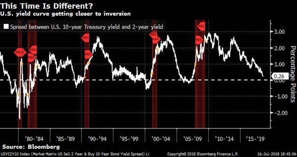
A cursory view of history reveals the reason for their concern. As shown below, every recession (red shaded regions in the graph below) since 1980 was foreshadowed by the yield curve turning negative.

The yield curve’s relationship with the economy has to do with credit formation. Banks borrow short-term money via deposits and use those funds to make longer-term loans. Theoretically, when the yield curve is steep, higher net interest margins provide banks a greater incentive to lend, which stimulates economic growth.
Since 2015, the Federal Reserve has been hiking short-term interest rates while long-term rates have only increased marginally. That’s why the yield curve is flattening.
As we approach the zero boundary, the chorus of bearish predictions will grow louder. Before you aggressively fade your equity market exposure, though, consider the following points.
Unpredictable lag time
Since 1978, the lag time between yield curve inversion and the start of the next recession has ranged from 10 months to 24 months. That may not seem like a big deal, but sitting with a lot of cash for a year or two while the market rises can be a lot more painful than it seems on the front-end.
Moreover, the time lag between inversion and market corrections is even wider—ranging 2 months to 23 months. In February of 2000 the yield curve inverted, and the market peaked just two months later. In December of 2005, the curve inverted again, but that time it took 23 months for the market to buckle.
This begs the question—if you want to time the market via the yield curve, when do you get out?
Being too early can cost you. The average S&P 500 return from the point of inversion to the start of recession is around 15%.
On the flipside, being a few months tardy can also work against you. For example, when the curve inverted in February 2000, a recession didn’t start until March of 2001. But the S&P 500 fell over 15% between that time.
Bottom-line: there isn’t a precise compass for using the yield curve as a timing device.
Yield curve regimes are widely misunderstood
Most people think the yield curve’s big “sell signal” happens when it inverts.
However, the most ominous yield curve condition is actually the bull steepening phase. That’s when the Fed is cutting short-term rates and the yield curve is widening. This often occurs when earnings are in a recessionary spiral, and the Fed scrambles to respond by lowering rates.
The table below shows a breakdown of S&P 500 returns across different yield curve regimes since 1990 (source: Bloomberg). The average annual return is positive in each of the bear phases (i.e. when the Fed is raising rates). Returns are best in bear-steepening phases—when long-term rates are rising faster than short rates. This environment is usually characterized by strong earnings growth, which is an important tailwind for equities.
Surprisingly, the average return during inversion periods is positive.

***
It’s easy for investors to look at a yield curve graph with recession markers, see an obvious pattern, and feel an impulse to head for the hills. However, timing the entry and exit is tough on both ends.
The reason there isn’t a consistent way to time yield curve moves, in my view, is because a flattening yield curve is a symptom of what leads to recessionary conditions, not the cause.
The Fed does not control the pace of lending as much as most people think. Just look at this cycle. The Fed implemented several rounds of QE, stuffing bank balance sheets with record reserves. This gave banks the capacity to lend. Moreover, the Fed kept short-term rates at zero for much longer than normal, orchestrating a steep yield curve.
Did the Fed’s ultra-easy policy result in a lending bonanza? Or strong economic recovery?
Nope.
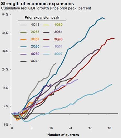
While this economic recovery is plenty long in duration, the expansion also happens to be the weakest in terms of GDP growth in the post-World War II period (source: JPMorgan's Q3 2018 Guide to the Markets).

Here’s the glitch: to make loans, banks need borrowers who want access to the economy’s resources to produce. In that vein, credit creation is more the result of the productive capacity and animal spirits of an economy than it is a direct reflection of central bankers playing games with interest rates.
The only thing a flat or inverted yield curve really tells you is something you should already know from an assortment of other indicators. That is: we’re late-cycle.
In late-cycle environments, labor market tightness creates wage pressures. Inflation in wages and other input costs spur the Fed to raise borrowing costs. Eventually, profitability peaks. As profitability begins to decline, a negative feedback loop commences whereby businesses and consumers gradually retrench. Eventually, we end up in recessions and bear markets.
How quick this all takes place varies across cycles, and that’s partly because there isn’t just one indicator or factor at play. It’s a comingling of many factors. Markets are complex, reflexive systems, which continually discount all known information. Keep that in mind any time you read articles that try to deduce what you should or shouldn’t do with your portfolio based on a singular indicator—whether it be the yield curve or something else.
Originally published by RealClearMarkets. Reprinted with permission.
This material is not intended to be relied upon as a forecast, research or investment advice. The opinions expressed are as of the date indicated and may change as subsequent conditions vary. The information and opinions contained in this post are derived from proprietary and nonproprietary sources deemed by Silverlight Asset Management LLC to be reliable, are not necessarily all-inclusive and are not guaranteed as to accuracy. As such, no warranty of accuracy or reliability is given and no responsibility arising in any other way for errors and omissions (including responsibility to any person by reason of negligence) is accepted by Silverlight Asset Management LLC, its officers, employees or agents. This post may contain “forward-looking” information that is not purely historical in nature. Such information may include, among other things, projections and forecasts. There is no guarantee that any of these views will come to pass. Reliance upon information in this post is at the sole discretion of the reader.
Testimonials Content Block
More Than an Investment Manager—A Trusted Guide to Financial Growth
"I’ve had the great pleasure of having Michael as my investment manager for the past several years. In fact, he is way more than that. He is a trusted guide who coaches his clients to look first at life’s bigger picture and then align their financial decisions to support where they want to go. Michael and his firm take a unique and personal coaching approach that has really resonated for me and helped me to reflect upon my core values and aspirations throughout my investment journey.
Michael’s focus on guiding the "why" behind my financial decisions has been invaluable to me in helping to create a meaningful strategy that has supported both my short-term goals and my long-term dreams. He listens deeply, responds thoughtfully, and engages in a way that has made my investment decisions intentional and personally empowering. With Michael, it’s not just about numbers—it’s about crafting a story of financial growth that has truly supports the life I want to live."
-Karen W.
Beyond financial guidance!
"As a long-term client of Silverlight, I’ve experienced not only market-beating returns but also invaluable coaching and support. Their guidance goes beyond finances—helping me grow, make smarter decisions, and build a life I truly love. Silverlight isn’t just about wealth management; they’re invested in helping me secure my success & future legacy!"
-Chris B.
All You Need Know to Win
“You likely can’t run a four-minute mile but Michael’s new book parses all you need know to win the workaday retirement race. Readable, authoritative, and thorough, you’ll want to spend a lot more than four minutes with it.”
-Ken Fisher
Founder, Executive Chairman and Co-CIO, Fisher Investments
New York Times Bestselling Author and Global Columnist.
Packed with Investment Wisdom
“The sooner you embark on The Four-Minute Retirement Plan, the sooner you’ll start heading in the right direction. This fun, practical, and thoughtful book is packed with investment wisdom; investors of all ages should read it now.”
-Joel Greenblatt
Managing Principal, Gotham Asset Management;
New York Times bestselling author, The Little Book That Beats the Market
Great Full Cycle Investing
“In order to preserve and protect your pile of hard-earned capital, you need to be coached by pros like Michael. He has both the experience and performance in The Game to prove it. This is a great Full Cycle Investing #process book!”
-Keith McCullough
Chief Executive Officer, Hedgeye Risk Management
Author, Diary of a Hedge Fund Manager
Clear Guidance...Essential Reading
“The Four-Minute Retirement Plan masterfully distills the wisdom and experience Michael acquired through years of highly successful wealth management into a concise and actionable plan that can be implemented by everyone. With its clear guidance, hands-on approach, and empowering message, this book is essential reading for anyone who wants to take control of their finances and secure a prosperous future.”
-Vincent Deluard
Director of Global Macro Strategy, StoneX

